Menu
Close
Home
About
Services
Work
Journal
Contact
Book a Chat
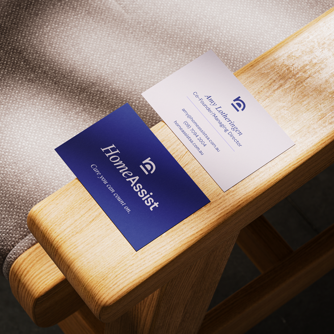
Home Assist SA
NDIS & Aged Care
A refreshed visual identity for a care provider that actually shows up.
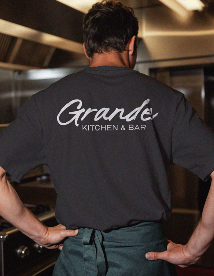
Grande Kitchen & Bar (VIC)
Hospitality
Contemporary brand identity built for warm hospitality and those late Tuesday nights.
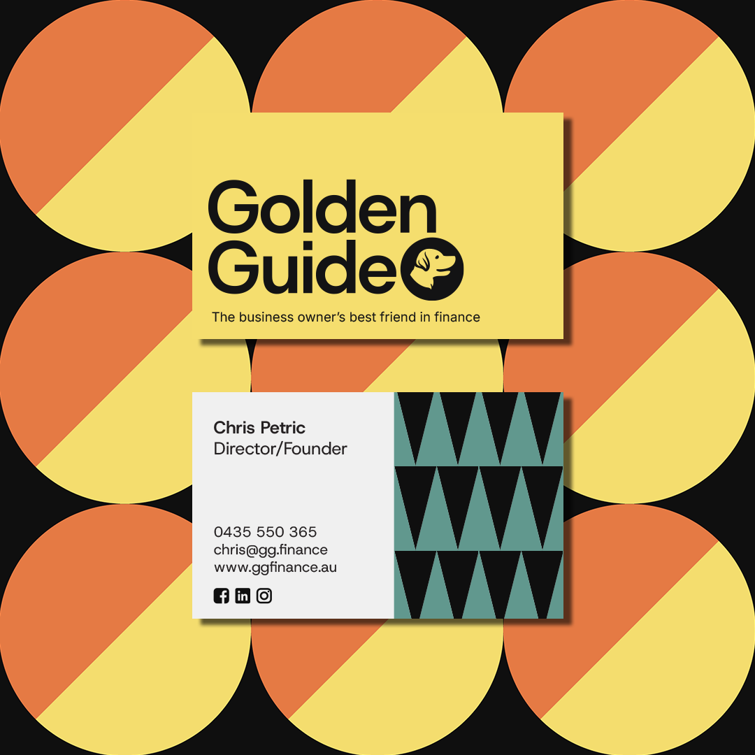
Golden Guide Finance
Asset Finance
A brand identity for an asset finance broker that shows up like a mate; not a sales script.
Complete Disability Services
NDIS & Allied Health
In a space where reliability is everything, we made sure it showed.
Rascals Deli & Wine
Hospitality
A brand as rough-around-the-edges and unapologetically good as the food itself.
Coach Biggie
Power Lifting Coach
A strong-man needs a strong visual identity and structured programs.
AAA Maintenance & Landscaping
Trades & Home Services
Approachable, dependable, and built for the kind of team your neighbours keep recommending.
Velvet Underground
Hospitality
Grainy textures, handwritten edges, and just enough static to make it feel alive.
Let's Chat
Book a Project Fit Check
Send Message