


Home Assist SA started, as the name suggests, doing house cleaning. Not even 2-years in, and they'd grown into something much bigger: personalised in-home care and support across NDIS (assistance with daily life, community participation, home and yard maintenance) and aged care, all across South Australia.
Problem was, the brand hadn't grown with them. The old logo was still doing exactly what it was built to do back when cleaning was the whole business: a pitched roof, a wavy line underneath. It made sense once. It didn't make sense for a team supporting people to live safely and confidently in their own homes. It needed a proper rebuild, not a touch-up: a branding and graphic design overhaul that could carry NDIS and aged care support as easily as it once carried house cleaning.
Amy, who runs Home Assist SA, knew this. She had a clear picture of where she wanted the business to go. What she didn't have was the language for it, and that's a common gap between "I know what I want" and "I can describe it to a designer." That gap is usually where a rebrand stalls or turns into months of guesswork. This one didn't, because the brief was treated as a starting point rather than the finished spec, and the strategy got built through discovery rather than assumed upfront.
Most brand archetype work picks a single character and runs with it. For Home Assist SA, one wasn't enough, because the brand has to do two different jobs at once: how the organisation supports its own team, and how it shows up for the people it cares for.
Internally, the brand leans on the Caregiver. That's not just a values statement, it shaped specific operational decisions: staff get told about changes before participants do, always in person before anything goes out by EDM. Complaints get heard out fully before anyone jumps to a fix. The things that break trust fastest, not following through, going quiet on a request, got written down as things to actively avoid.
Externally, the brand leans on the Everyman. Plain language over jargon. Warmth in the small stuff: tone of voice, word choice, especially over text where it's easy to sound cold by accident. The idea that whatever someone's dealing with, they're not the first person to go through it, and the brand should make them feel that.
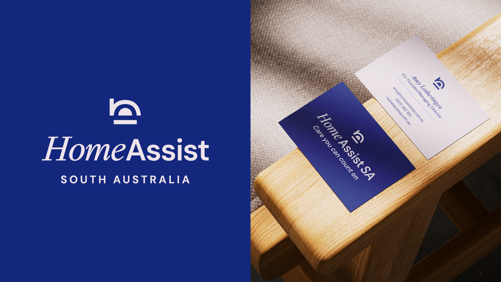
That thinking became the Abode icon, a simple architectural mark built from three balanced shapes: home maintenance, in-home care, and support & foundation; the three pillars the business runs on. Paired with it: a calm navy and blue palette with soft periwinkle and blush accents (nothing clinical and cold), and a typeface pairing doing the same double duty as the archetypes, an elegant italic serif for warmth and a clean sans serif for clarity. The tagline had been approved well before the rebrand; "Care you can count on." But now Home Assist SA has a visual identity system built to prove that true.
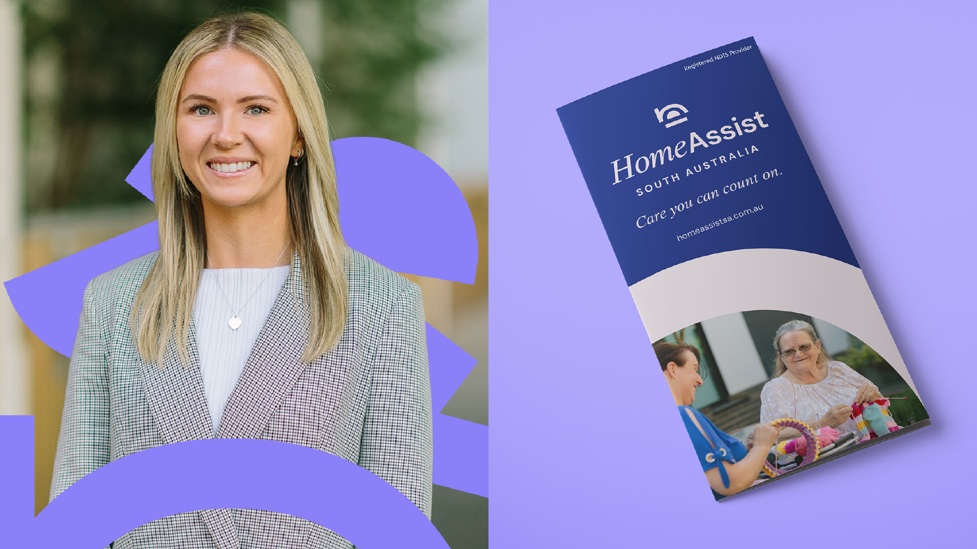
From there it was a full brand rollout: a new logo suite (a primary lockup, a compact wordmark, a standalone icon for favicons and small formats), business cards, a presentation folder, a brochure, signage concepts, and staff apparel. The apparel's the last piece still in production, a week or two out at the time of writing. Liam handled the back and forth with the printer right up until Amy took over the invoicing, because a brand handover shouldn't stop at the file transfer.
The website has been built separately by collaborator of Longshot: Studio Sondar, so that reveal belongs to them.
Amy summed up the process better than any case study could:
"Liam did an absolutely phenomenal job with our branding refresh. He was a pleasure to work with, quickly understood our vision (even when our brief was a little unclear!), and brought our ideas to life. We were genuinely impressed with the quality of his work, his communication throughout the process including willingness to make adjustments, and how efficiently everything was delivered. We will absolutely continue working with Liam as our business grows."
That last line's the real outcome. Home Assist SA isn't a closed project, it's an ongoing one, which is usually the sign a brand actually worked: not that it looked good on delivery day, but that the client wants to keep building with it.


